
Craigslist was launched in 1995, and it sure does look like it.
As someone who’s used Craigslist for years, I’ve become accustomed to the cumbersome design of the site. However, a clunky, text-heavy, and overwhelming interface often results in a poor user experience for untrained buyers and sellers. The goal of this project was to create a new and updated design concept for the desktop version of the Craigslist website that would allow people to find exactly what they’re looking for–no previous experience necessary.
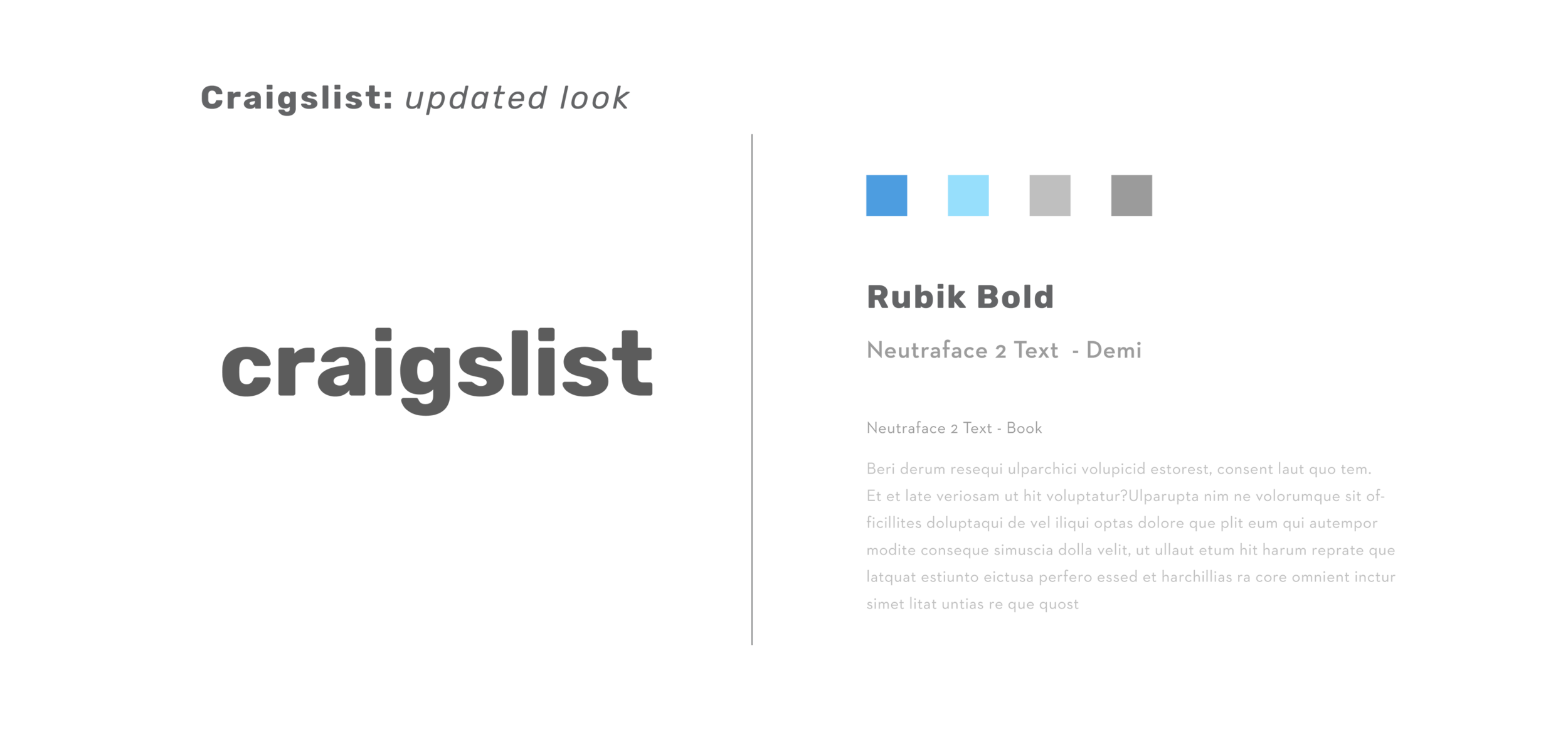
Rubik was the typeface of choice for this updated wordmark. A sans serif font with playful curves and a smooth edges, it evokes a friendlier feel. Neutraface was used for the body text, subheadings, and captions, which pairs well with Rubik. It also reads well at small sizes. The color palette features a much more subdued blue with soft grays. The variations in color from dark to light provide a variety of options when constructing a typographic hierarchy. Blue gradients are used for buttons throughout the design.
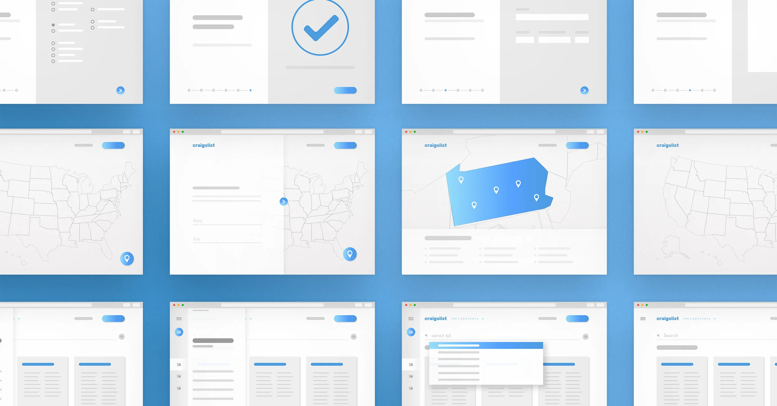
Before beginning the design process, I created a series of wireframes. In doing so, I began to explore the placement of key elements while making determinations about user flows and establishing fundamental hierarchies.
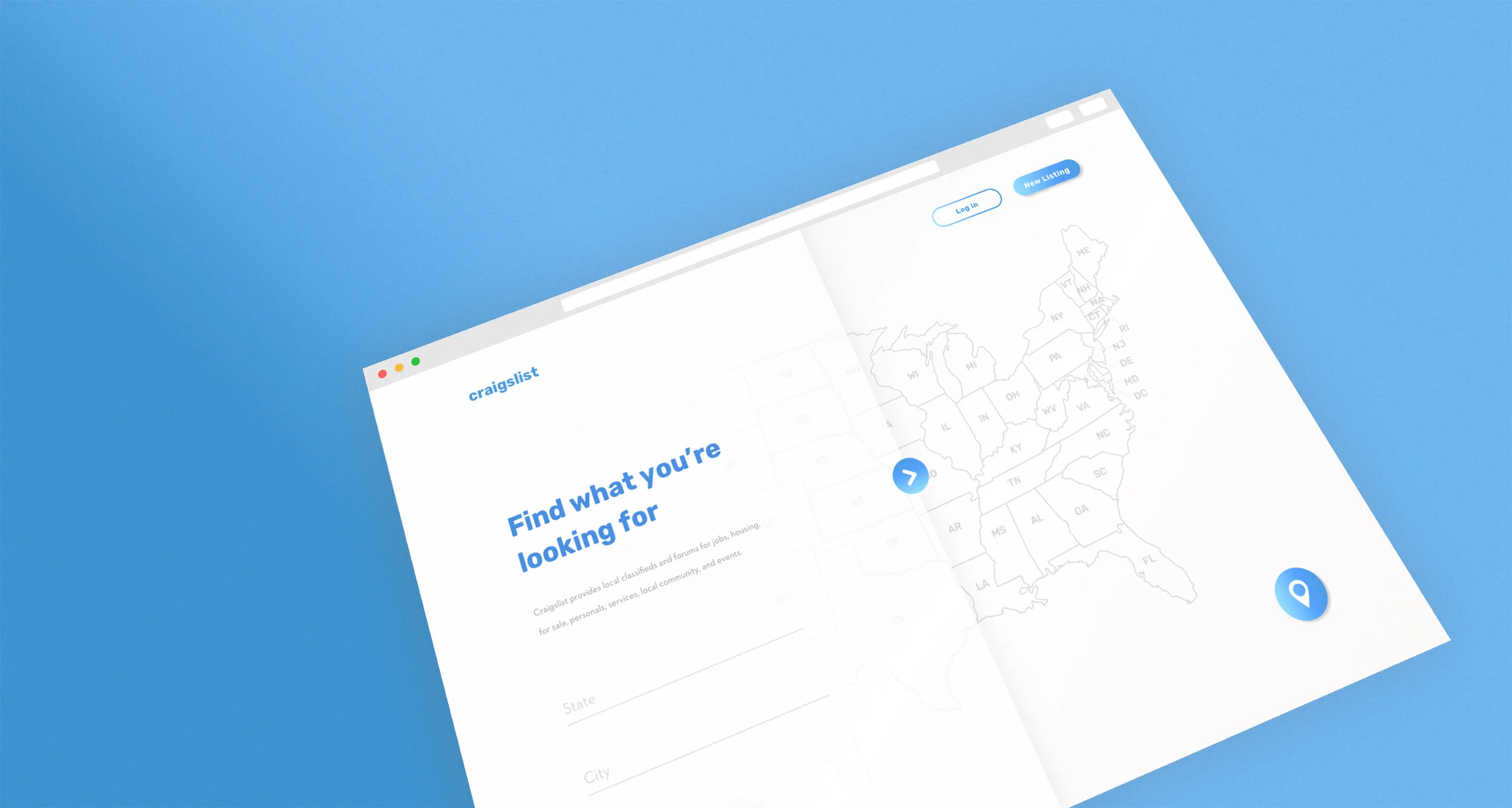
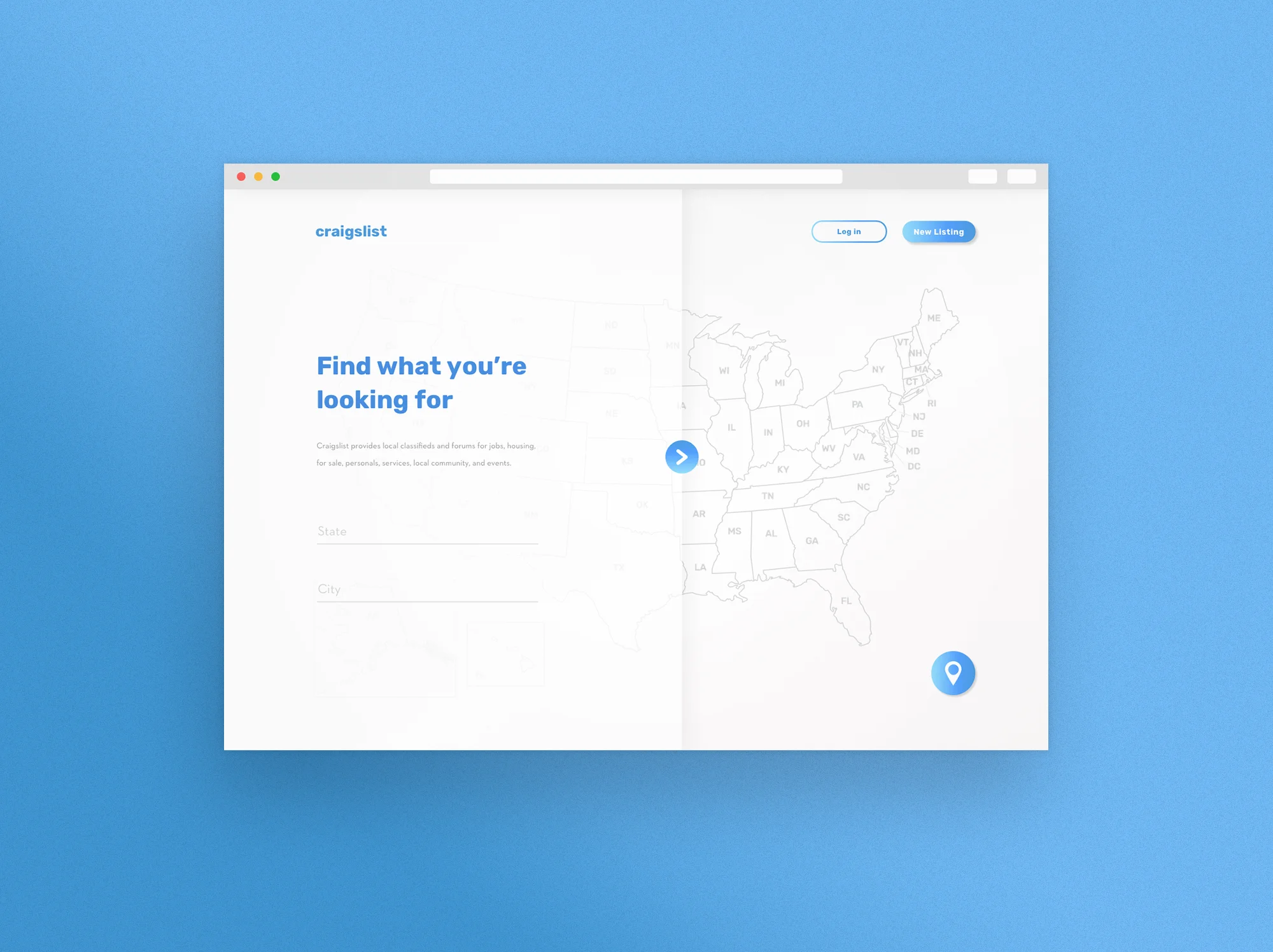
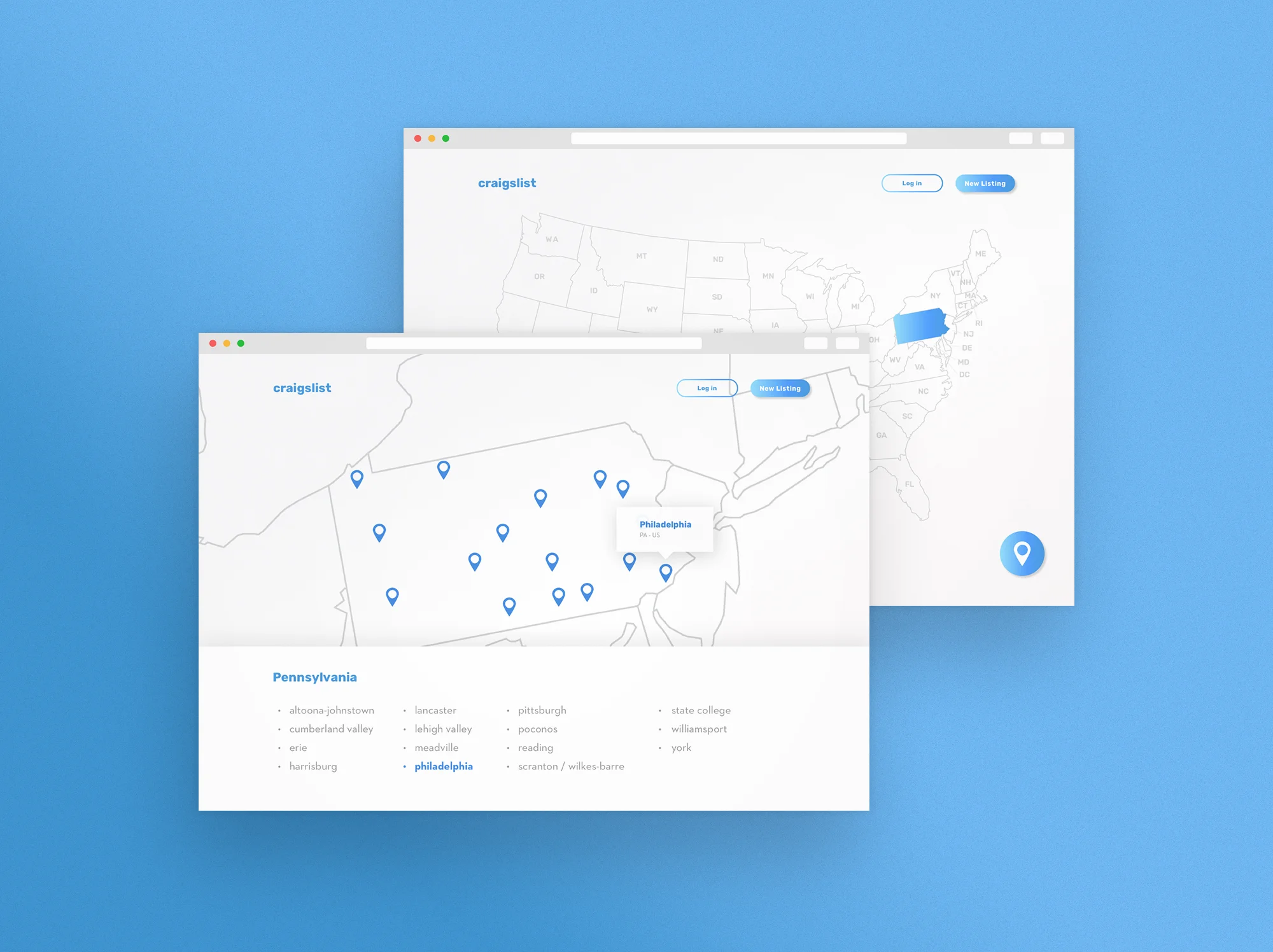
The current location finder on Craigslist’s site leaves something to be desired. The user experience reminds me of a buggy, downgraded version of Google Maps. This location page is rarely seen again, but that initial impression when first entering the site is crucial. I wanted this page to be simpler, less cluttered, and easier to use.
Clicking on a state will allow you to zoom in for a closer look. Users can either rollover/select a pin on the map or a name in the list to choose a city.
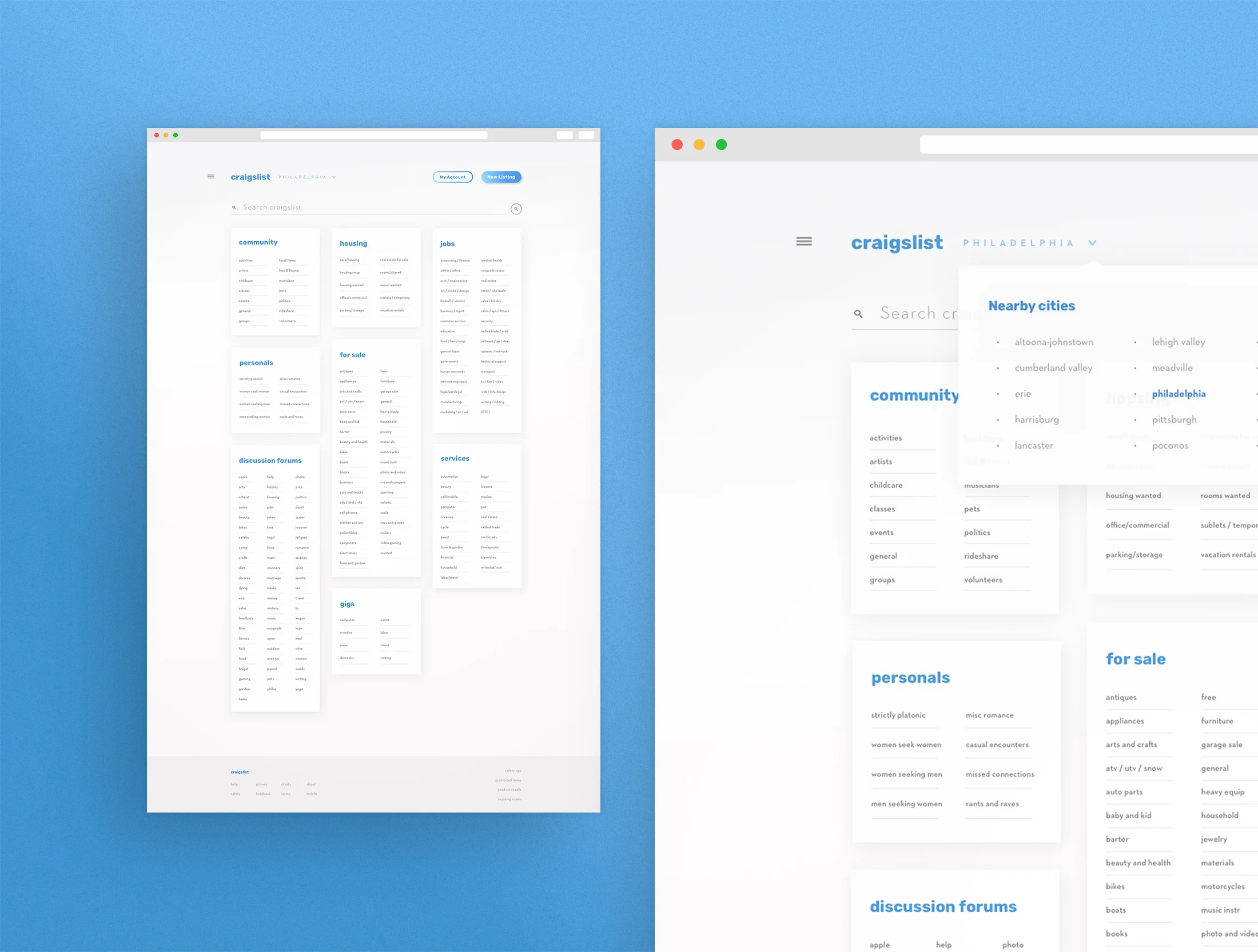
The not-so-memorable yet oh-so-iconic home page of the original site was overwhelming to say the least. I’ve reduced clutter on the sides of the page, placing non-essential information in the sidebar or in the footer. Each section and subsection is contained in a tidy window with much greater line spacing for increased readability. By making some simple adjustments to the typography and creating more visual separation, a once overwhelming web page seems a bit more approachable.
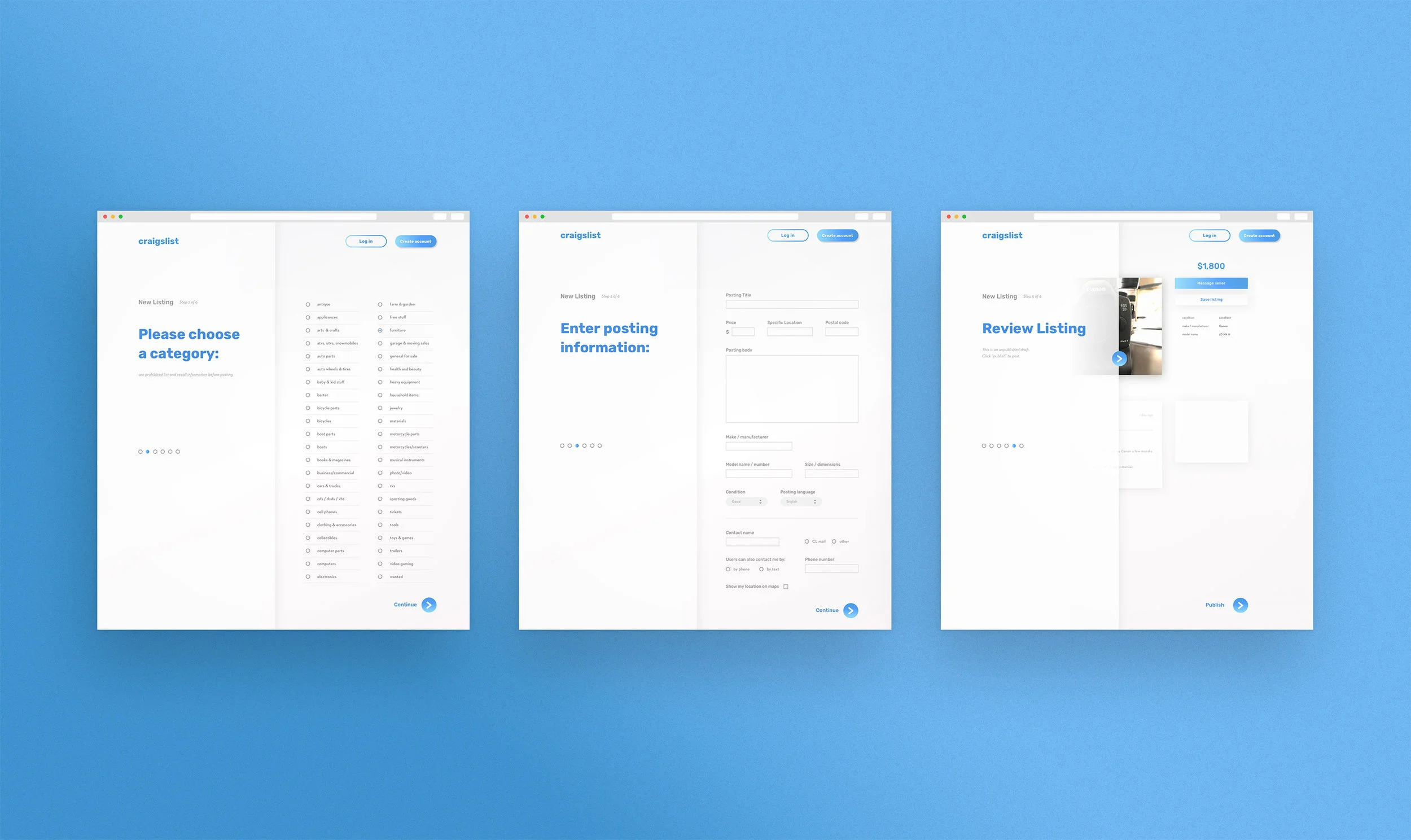
The step numbers and the instructions are restricted to the left side of the screen for easy viewing. This also reduces the amount of scrolling necessary to create a new post.
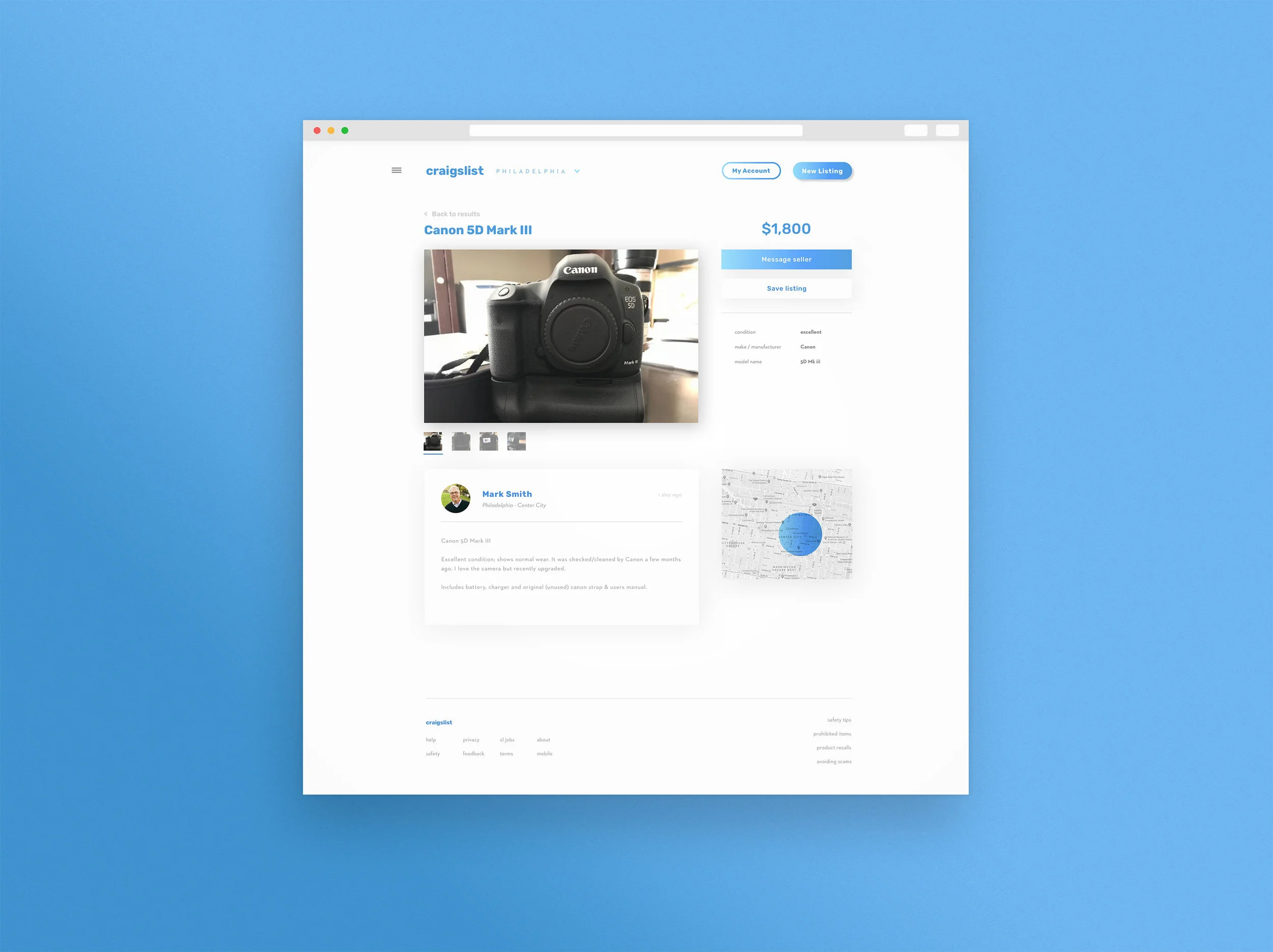
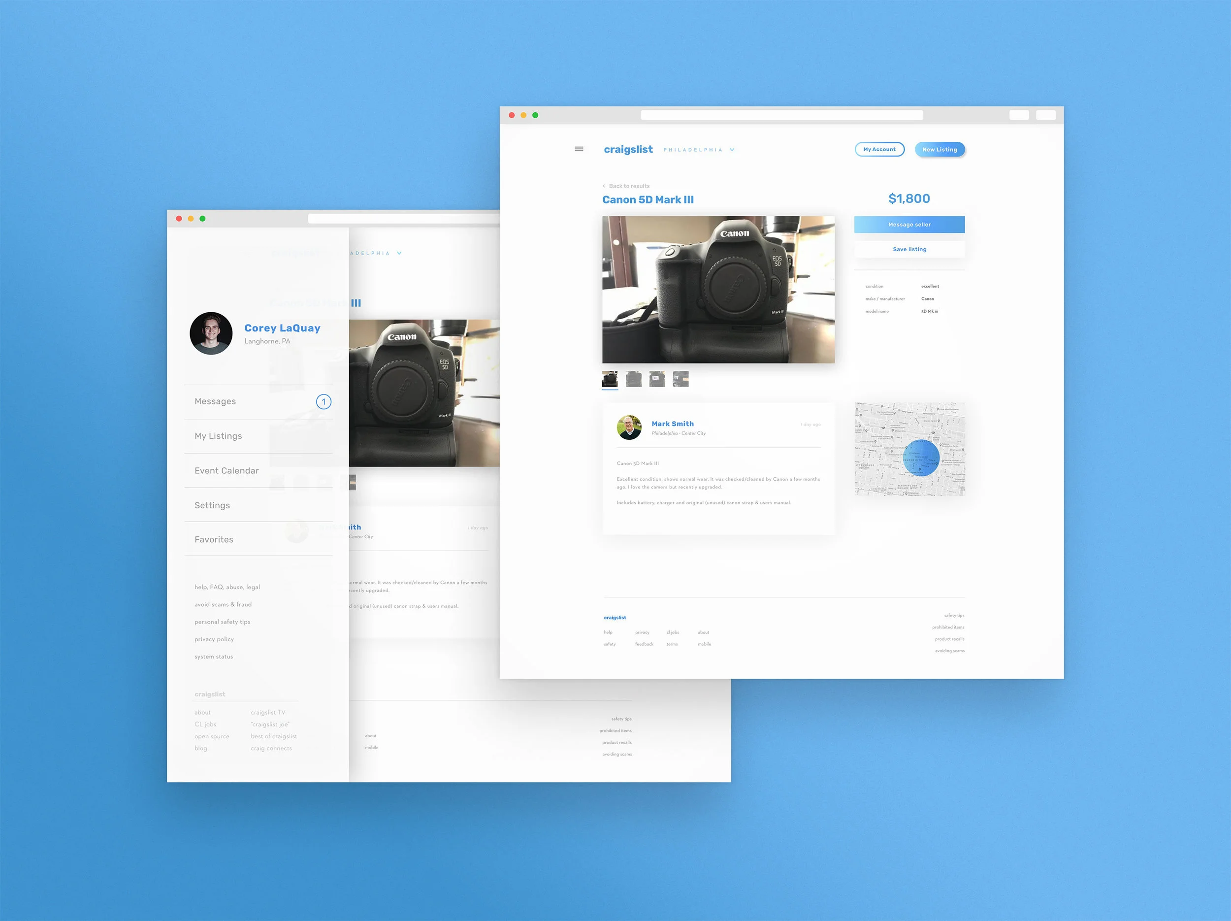
Though it follows a familiar formula, the new listing page has improved upon some of the clunky features within the current site. Integrated messaging and sharing buttons are built into the sidebar, streamlining the communication process. Rather than launching an external e-mail client, users can message the seller without leaving Craigslist. There is also a save button that allows users to bookmark the listing for later. These saved posts are viewable in the user’s profile. The listing’s sidebar also lists important facts and figures about the item being sold instead of being nestled beneath the post.
Clicking the hamburger button at the top of the page reveals a menu that houses the user’s profile, inbox, current listings, and saved posts. This also houses the event calendar and settings page.
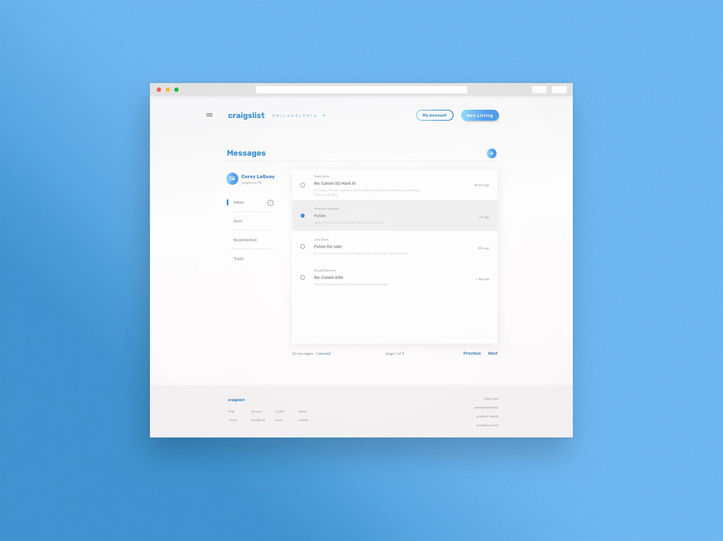
Messaging is a feature absent from the current version of Craigslist and is something that I’ve always wished was integrated into the site. Within this feature, users can contact one another and respond quickly and easily to inquiries regarding listings.